


There is often much confusion over which color space is the best solution for your studio. Hopefully, we can simplify it here.
Several speakers and instructors promote using the ProPhotoRGB color space as your basic working space for Photoshop because of its wide color gamut. ProPhotoRGB is the widest color space available, we don’t dispute that. The problem is there are no monitors that can display that color range, and you can’t print it. Yes, you can send it to a printer, but what you get is not what is really in the image.
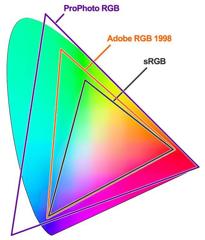 In short, a color space is the range of colors that can be displayed within that space. Adobe 1998 and sRGB only represent about one-third of the colors perceptible to the human eye, ProPhotoRGB about half. When working on an image, you need a monitor to represent the colors in the image, then, that needs to translate to the final product that you want to produce.
There is ZERO value in working in a ProPhoto RGB workspace in a typical studio environment. It only opens the door to potential problems and errors. It's strictly an internal numbers thing. It's like working in an imaginary state, then the reality hits and you go oh-my, why is this wrong? If you work in ProPhotoRGB, you have to convert the file to a space you can work with prior to any final production. Why add that extra step?
Most everyone should be working in sRGB. If you print EXCLUSIVELY to wide-gamut inkjet, you can work in Adobe 1998. If you work in a mix of traditional photographic materials and possibly some wide-gamut inkjet, use sRGB. Labs using traditional photographic paper can only reproduce to an sRGB color space. They may tell you they accept Adobe98, but they just convert it to sRGB when it hits the lab.
When working with portraits, there is little difference in sRGB and Adobe 1998 in that the color spectrum represented is very similar in the colors used to generate skin tones.
If you are producing digital files for clients, they should be sRGB.
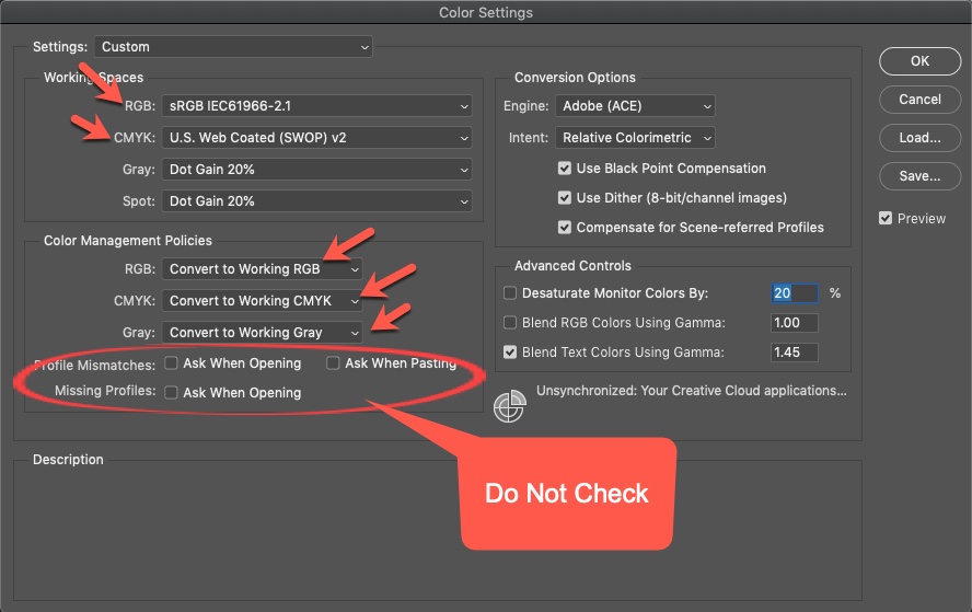
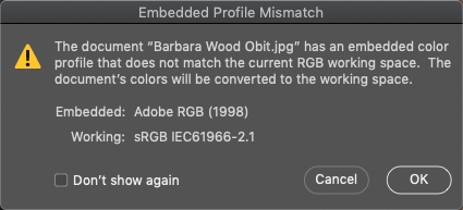
These settings apply to Photoshop. Go to Edit > Color Settings. See the screenshot and set yours like it. When you open a file and get a profile mismatch warning, click “Don’t show again”, then OK. This will ensure your image is in the correct working space each time you open an image. Once you click don’t show again, you’ll never see it again.
When running ProSelect production, Photoshop manages all the colors for the output images. Following this process, everything will fall into place and make your life simpler.
KnowledgeBase Article: Photoshop Color Settings